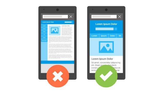
Modern mobile design uses responsive layouts to shrink, stretch and fit a website onto any size screen, so the user doesn’t have to pinch zoom on their phone or tablet to view the website. Plain and simple there should be no horizontal scrolling required on mobile devices. But that isn’t the end of what mobile design fully incorporates.
/
Blog
Latest Posts

Content Writing
As Search Engine Optimization becomes increasingly more important for your website so too grows the need for better content writing. But many struggle with knowing just exactly what good, or great content, really is and how to measure it.
Mobile Usage Statistics
It is often stated these days that mobile usage is increasing more and more. More people are using the internet on the phones or tablets than are using it on a desktop computer. But just how much are we using our phones? Read more

The Importance of Keeping WordPress Updated
We were recently approached by a company whose website had been infected with malware. One might think, malware on a website, for what purpose?

HTTPS Popularity Hits 30%
A recent study by SEO giants Moz, observed the increasing popularity of websites using HTTPS, with the data showing that around 30% of websites today are using HTTPS.

Why Your Website Needs To Be Mobile Friendly
Since the dawn of smartphones, more and more people are accessing, and searching the internet via their mobile device. In fact, using the internet on a smartphone or tablet, has become more popular than accessing the internet on a desktop computer or laptop. More than half of all internet traffic now comes from smartphones and tablets.

Link Building
Internal and external link building are powerful page rank boosters essential to growing your website’s SEO and getting more exposure. SEO is a balance between having great technical practices and highly relevant content for users. Link building, when used properly, helps users and search engines navigate your website’s content easily.
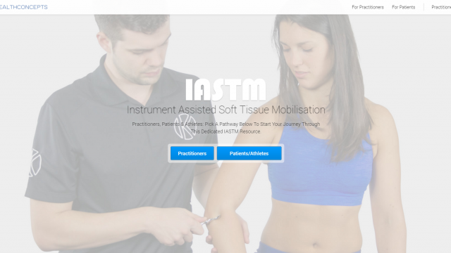
Just Launched: KIASTM Upgrade
KIASTM is a division of Ki Health which focuses on Instrument Assisted Soft Tissue Mobilisation, or IASTM.
The KIASTM website was created to help the general public, patients, and athletes alike to learn more about IASTM and make the right decisions about which IASTM practitioners best suit their needs.
The upgrade to the KIASTM website includes new features with rich functionality. The new landing page highlights the two sections of the website: practitioners and patients. The new practitioners section of the website features rich functionality and deep content for practitioners using Instrument Assisted Soft Tissue Mobilisation.
Type: Custom WordPress CMS website development

Why is SEO so important?
Search Engine Optimization is an investment for the future of your business.

Just Launched: Heartstarters Inc.
Heart Starters Inc. provides a wide variety of accredited training and services to organizations and companies across Canada. Offering on-site training to save your company time and money.