
It is widely known that using the image tag is better SEO practice than using background images because of the screen reader implications. But we know too well how difficult it can be sometimes using image tags within constrained proportions and responsive environments.
/
Blog
Responsive (Mobile)

Mobile Design Means More Than Responsive Layouts
Modern mobile design uses responsive layouts to shrink, stretch and fit a website onto any size screen, so the user doesn’t have to pinch zoom on their phone or tablet to view the website. Plain and simple there should be no horizontal scrolling required on mobile devices. But that isn’t the end of what mobile design fully incorporates.
Mobile Usage Statistics
It is often stated these days that mobile usage is increasing more and more. More people are using the internet on the phones or tablets than are using it on a desktop computer. But just how much are we using our phones? Read more

Just Launched: Heartstarters Inc.
Heart Starters Inc. provides a wide variety of accredited training and services to organizations and companies across Canada. Offering on-site training to save your company time and money.

Behind the Scenes at SproutingPhotographer.com
SproutingPhotographer.com is all about photography business education. We have a great team, including writers, editors, programmers, web developers and graphic designers. We’re always pushing the envelope in business education for photographers, and are constantly inventing new tools for implementation. Read more
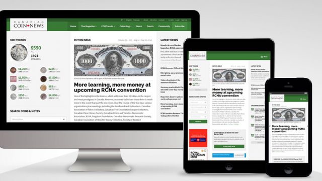
Just Launched: Canadian Coin News
Canadian Coin News is Canada’s premier magazine and source of information about coins, notes, and medals.
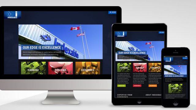
Just Launched: Indexable Cutting Tools
For more than 40 years, Indexable Cutting Tools’ mastery of insert production and precision cutting technology has provided manufacturers around the world with an edge in operational efficiency. Read more
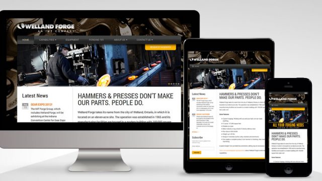
Just Launched: IMT Corporation
The IMT group of companies is passionate about engineering, forging, machining and finishing the superior quality metal components that keep the world’s Transportation, Oil and Gas, Mining, OEM and Defence industries moving forward. Read more
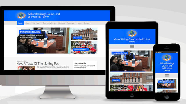
Just Launched: Welland Heritage Council
Welland Heritage Council and Multicultural Centre was founded in 1976 to assist newcomers and various ethnic groups in the Welland area. They provide services for newcomers as well as organize and host many community events. Read more
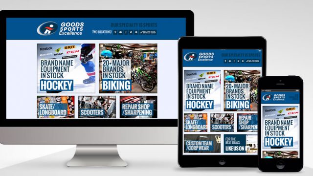
Just Launched: Goods Sports Excellence
Goods Sports Excellence has been a staple business in Niagara ever since we can remember. Today, they are Niagara regions #1 sporting goods store specializing in hockey, BMX and mountain bikes, scooters, longboards and skate boards. Read more