 For many businesses, it is imperative their website is either responsive (a fancy term for a website that magically adapts to any screen ie. desktop monitors, iPads, or your mobile phone) or that they have a seperate mobile version of their website.
While some of our clients like kevinkee.ca or granderiehomehardware.ca have opted for a fully responsive website (a fantastic idea btw!), it is not always in ones budget.
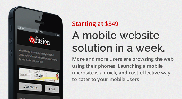
Introducing: Mobile Microsites!
Simple: a one-page website that is specifically designed for small screens; with all of the most important details: location, phone, email, hours and a link to your full website! The site is automatically loaded for mobile users!
Plus, you can add downloadable menus, PDF files, catalogues, and more!
It all starts of $349 and includes customization for:
- Logo
- Colour scheme
- Map Button (Opens Map App)
- Phone Button (Calls on click)
- Email Button (Emails on click)
- Contact Info
- Social Media Buttons
- Hours
- Link to Full Website
Demo: https://vxfusion.com/mobile
Get Started: info@vxfusion.com