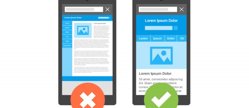
Modern mobile design uses responsive layouts to shrink, stretch and fit a website onto any size screen, so the user doesn’t have to pinch zoom on their phone or tablet to view the website. Plain and simple there should be no horizontal scrolling required on mobile devices. But that isn’t the end of what mobile design fully incorporates.
With the increasing number of mobile devices, and their unique screen sizes, web designers and developers are creating websites (or should be) with responsive layouts in order to eliminate the dreadful pinch and zoom. Responsive layouts allow the content to flow freely inside the browser width while maintaining structure and creating a user friendly experience. But that is not where the user friendly experience ends.
Less Is More
The age old saying, used in marketing commercials for decades, less is more. When it comes to mobile design this saying describes perfectly how a designer or developer should look at a website’s content as the screen gets smaller. As always a website, or web page specifically, should always have the most important content display prominently and emphasized. On desktops, or larger screens, there is more room horizontally for content. As the screen size gets smaller the website elongates and makes the user scroll to see all the content. This is where the less is more principle becomes an advantage for mobile design. Shortening the most important content is not always easy, or necessary, but it increases the user friendliness of the mobile version that much more.
Call To Actions
Call to actions implemented specifically for mobile design have become a great way to get interact with users on mobile devices. A “Call Now” button in your header so users can contact your business quickly. Content anchors to move the viewport to important content on the same page, eliminating the users need to scroll, and getting them reading your content quicker and seamlessly. It is simple features like these that can help quicken the user’s experience on your website by providing them with what they want right away.
Summary
Typically users on mobile devices spend less time viewing websites when searching for something specific. These two examples when used properly can be highly effective for users on mobile devices by letting them know right away if your website was what they were searching for.